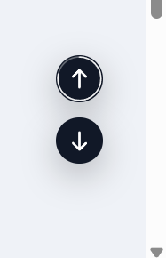
A tiny, polished utility that adds a floating Back to Top button across your community. It stays out of the way at the top of a page and appears only after you scroll halfway (or near the bottom). On desktop you can also show a “go down” button; on mobile the Up button is placed precisely above bottom bars and iOS safe areas (including PWAs).
Highlights
Clean UI with optional circular progress ring around the button.
Mobile-perfect placement (safe-area aware, PWA-aware, above the hamburger bar).
Desktop/phone behavior tuned separately (Down button hidden on mobile).
Keyboard access: press T to jump to the top.
Admin controls (ACP)
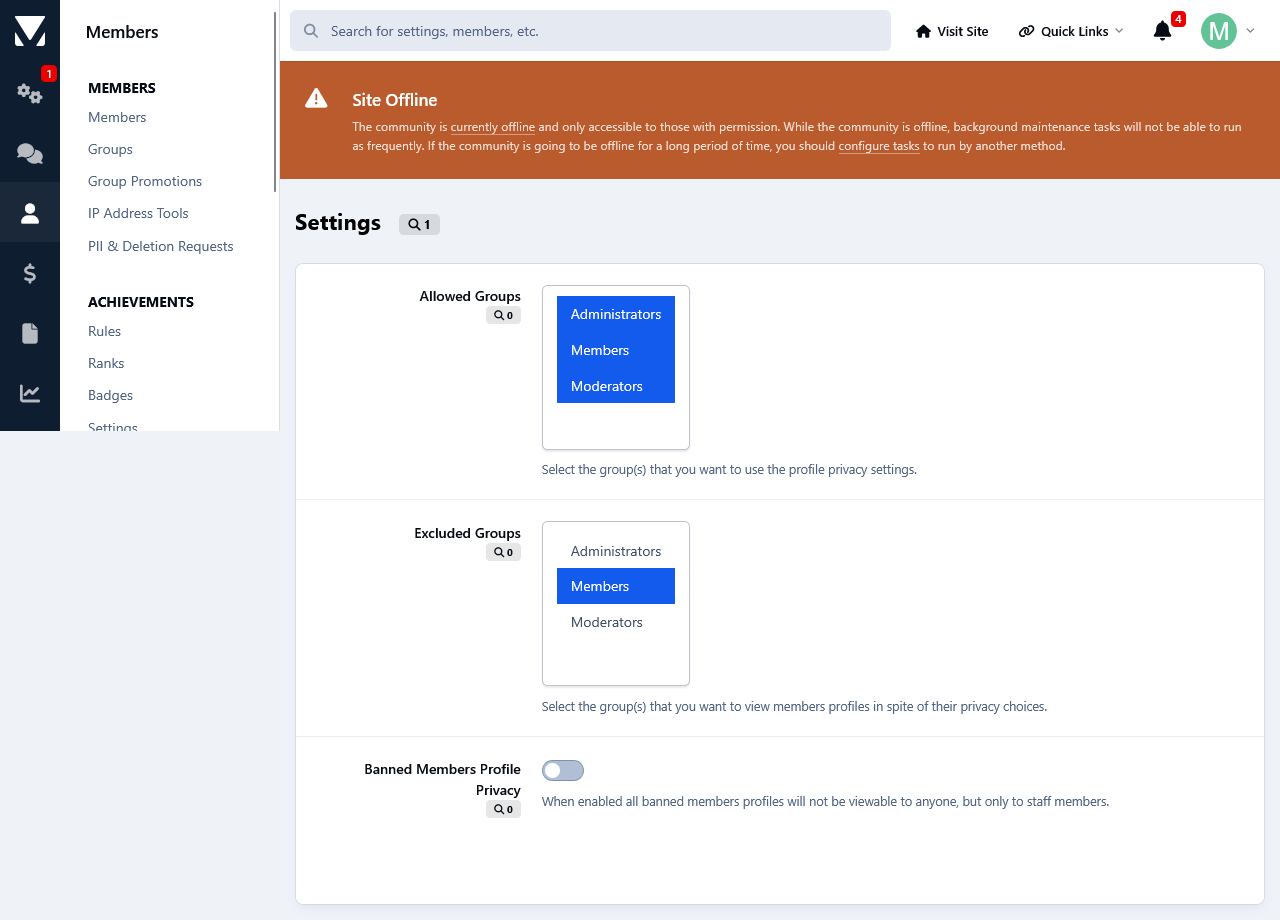
Find it under Customization → Appearance → Topper.
You can configure:
Position: bottom-right / bottom-left / top-right / top-left
Offsets (X/Y) + a separate mobile offset
Visibility: “Always show”, or show after N px (button also shows when near the bottom)
Size (desktop + mobile), shape (circle / rounded)
Colors: background, hover, icon, opacity
Smooth scroll on click
Progress ring toggle
Show on mobile toggle
Keyboard shortcut (T) toggle
Compatibility
Invision Community v5 (tested on recent builds)
Works with light/dark themes and custom themes
1.0.0
Initial release: progress ring, mobile/PWA safe positioning, desktop “Down” button, keyboard shortcut, half-page/near-bottom reveal logic, full ACP settings.

IPS5.0.0+
A tiny, polished utility that adds a floating Back to Top button across your community. It stays out of the way at the top of a page and appears only after you scroll halfway (or near the bottom). On desktop you can also show a “go down” button; on mobile the Up button is placed precisely above bottom bars and iOS safe areas (including PWAs).
Highlights
Clean UI with optional circular progress ring around the button.
Mobile-perfect placement (safe-area aware, PWA-aware, above the hamburger bar).
Desktop/phone behavior tuned separately (Down button hidden on mobile).
Keyboard access: press T to jump to the top.
Admin controls (ACP)
Find it under Customization → Appearance → Topper.
You can configure:
Position: bottom-right / bottom-left / top-right / top-left
Offsets (X/Y) + a separate mobile offset
Visibility: “Always show”, or show after N px (button also shows when near the bottom)
Size (desktop + mobile), shape (circle / rounded)
Colors: background, hover, icon, opacity
Smooth scroll on click
Progress ring toggle
Show on mobile toggle
Keyboard shortcut (T) toggle
Compatibility
Invision Community v5 (tested on recent builds)
Works with light/dark themes and custom themes
1.0.0
Initial release: progress ring, mobile/PWA safe positioning, desktop “Down” button, keyboard shortcut, half-page/near-bottom reveal logic, full ACP settings.

